New Yorker, I love you, but you're bringing me down.
May 16, 2010
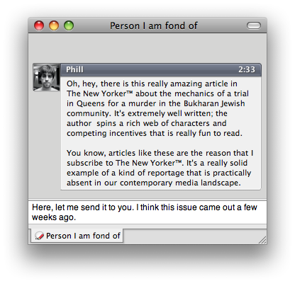
I was going through my backlog of New Yorker magazines when I came across something really neat that I would like to share with a friend.
This should not be difficult.
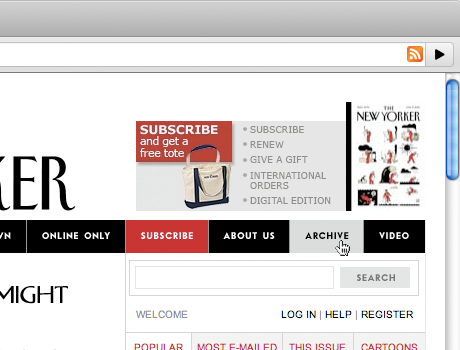
Wait. Where can I find the previous issues?
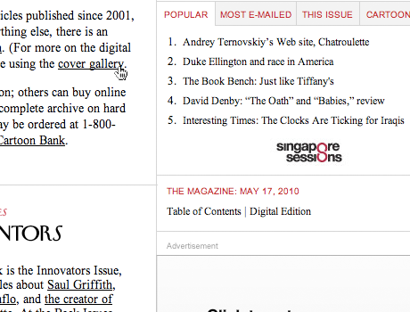
Well. Maybe I can access them through the 'cover gallery'.
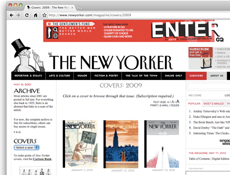
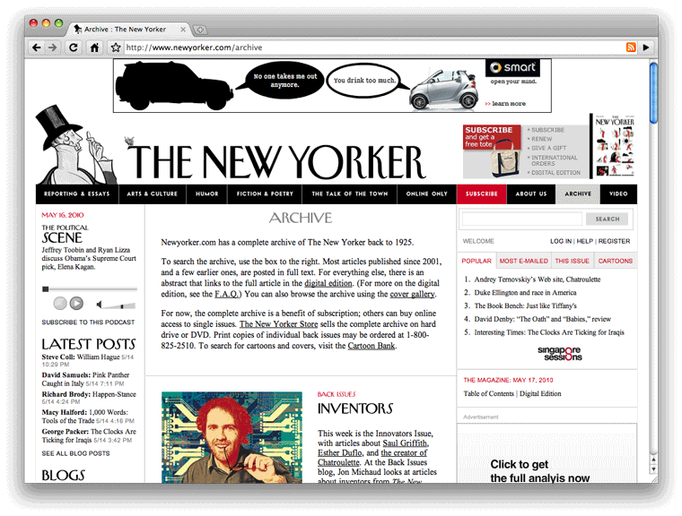
2009? Ugh. That was five months ago.
Oh, fuck off.
To be perfectly fair, if you notice carefully they warn you about it — but why have such a natural browsing interface if you're not going to direct people to more of your content?
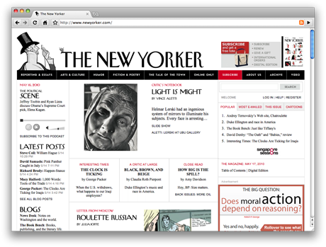
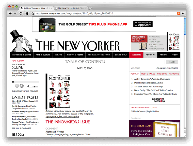
Okay. So I know they have an index page for the current issue of the magazine. Maybe it's listed there?
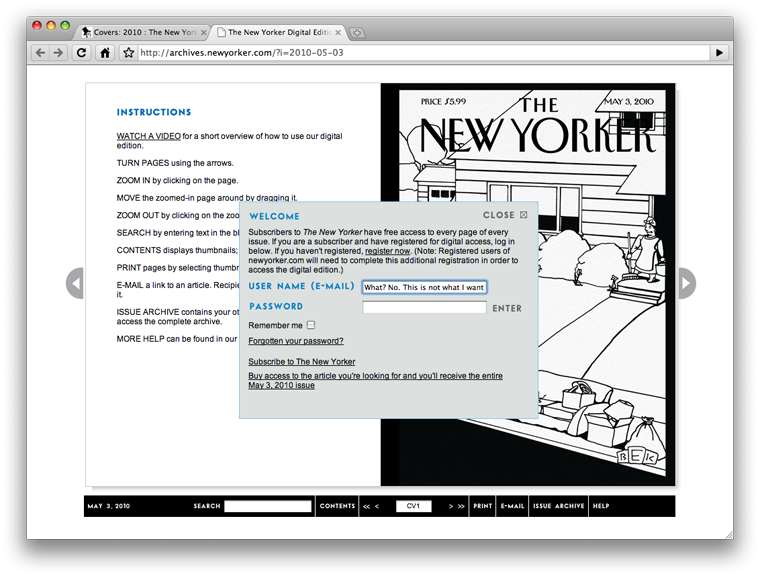
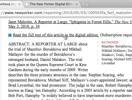
Unsurprisingly, the article is paywalled in their 'digital edition'. I am flabbergasted they call it that, considering I'm already on their 'digital website'.
Whatever. I'm a subscriber. Fine. You win. Let's do this.
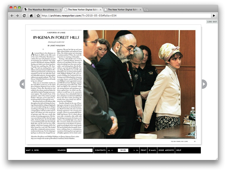
Needless to say, this interface is incredibly abysmal. Clicking on the page makes it jump to a single zoom level through which you are then supposed to pan and read.
Honestly, I've tried to use it before but it's just so incredibly annoying. This might be usable if you have a 24 inch screen? But on my 13 inch macbook it's more frustrating than anything else.
If memory holds, this interface came out back in 2007. At least they didn't use flash, but it was still short sighted of them to go with a 1:1 recreation of the magazine instead of converting it to a sectioned-off part of their (easier to read) website.
Mind you, I have a feeling I know exactly what happened here. The year is 2005, and someone decided to offer New Yorker connoisseurs the opportunity to own the entire archive in an offline format.
This was a brain damaged decision even back then, but to be fair Microsoft Encarta had yet to completely fail, Wikipedia was just about to enter the cultural mainstream and you could still categorically dismiss techie web-utopians with a straight face. So they managed to scan all of their back catalogue and bam!, now you too can own eight totally useless dvds that are completely impractical to use. I think this set used to cost something like $150 too.
I'm almost willing to bet money that when it became painfully obvious that online archives are now expected subscription perks they simply foisted all of the infrastructure they collected for the DVD version and here we are today. It's especially painful when you consider that you can perform a full-text search of the archive on the site, but no, you're stuck in this weird netherworld, fuck you.
At any rate, obviously I can't just email the article to my friend. I can't select any of this text. I know, I'll print the article and send her the pdf. In a better world they would've made the interface metadata aware and make your life easy, but maybe you can imagine the pain of printing a twenty-nine page article:
This yields a 24 meg pdf whose text you can't select.
What have we learned with this huge waste of my time?
- I'm a complete idiot. I should've just googled it.
- A paying customer enthusiastically wanting to promote your product got shut down repeatedly by your interface.
This is a jaded argument. I can probably link you to a dozen Clay Shirky essays that will say this more eloquently and more succinctly. I've been in this racket for a while; I make websites for a living. I am just stunned with how much effort I had to exert.
If you're in the business of delivering content, why is google the most useful way to peer into your back catalogue? I don't even want to get into a long tail discussion; Google is poor on serendipity.
We could forgive this big mishap if the 'digital edition' wasn't being promoted so heavily on their site. As it currently stands, it's clearly intended as a kludge to solve the problem poised by the internet. For an organization with so much high quality content I have a hard time comprehending the kind of thinking that has lead to their current condition. Your website shouldn't just reflect the newsstands, where only one issue is available at a time.
Let's not even talk about how crappy their blog section is.
This pains me because I want to keep reading the New Yorker for many years to come. I just love getting it in the mail every week but can you just imagine how insanely great their iphone and ipad apps could be? Or better yet, a webkit-optimized (subscriber) site?
Instead, their archive languishes and fades into obscurity.